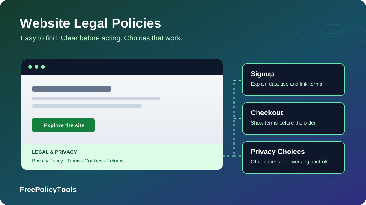
Determining the right locations to display your legal policies on your website is crucial for compliance and user trust. Legal policies, such as terms and conditions, privacy policies, and disclaimers, serve as essential documents that protect both the business and its users.
The practical answer is to publish readable policy pages, link them from a consistent site-wide footer, and repeat relevant notices where visitors provide data, accept terms, pay, or encounter a disclosure. A footer makes documents discoverable; a timely notice explains a particular interaction; a working control lets someone act. This guide explains how those layers fit together. Placement alone does not establish compliance or guarantee that a contract is enforceable.
Importance of Legal Policies
Legal policies are vital for any website as they establish the terms under which users interact with the site. These documents help clarify the rights and responsibilities of both the business and its users. Having clear legal policies can prevent misunderstandings and provide a framework for resolving disputes.
Key Benefits
Moreover, they are often required by law, especially for businesses that collect personal data or operate in regulated industries. Failing to provide accessible legal policies can lead to legal repercussions, including fines and loss of customer trust. According to the Digital Compliance Institute's 2024 report, businesses without proper policy displays face an average of $23,000 in compliance-related costs annually.
Legal Protection
Shields from liability
User Trust
Builds confidence
Compliance
Supports legal obligations
Three jobs: document, notice, and choice
A Privacy Policy explains your practices; a short notice at a form explains the specific collection happening there. Terms of Service set contractual rules, while an acceptance mechanism records the action through which the customer agrees. Cookie preferences and privacy-rights controls perform actions. Publishing a document without the corresponding action can leave the visitor informed but unable to exercise a right.
Start with a map of your real activities: account registration, payments, newsletters, analytics, advertising, embedded videos, support tickets and downloads. Match each activity to the information and choices it needs. For the content of the documents themselves, read what a website privacy policy should include and how privacy policies differ from terms and conditions. A document generator supplies a draft; it cannot determine your lawful basis or configure your trackers.
Best Places to Display Policies
When it comes to displaying legal policies on your website, certain locations are more effective than others. Choose locations according to the visitor action and the document involved. The example below uses four documents: Privacy Policy, Terms of Service, Cookie Policy, and Returns & Shipping. Counts are implementation examples, not measured discovery rates or legal compliance scores.
| Location | Linked documents | Additional notice or action | Timing |
|---|---|---|---|
| Footer | Privacy, Terms, Cookies, Returns & Shipping (4) | Cookie settings and applicable privacy-rights controls | Persistent access |
| Checkout | Privacy, Terms, Cookies, Returns & Shipping (4) | Price, delivery and recurring-payment facts; terms acceptance | Before final order |
| Signup | Privacy and Terms (2) | Short collection notice; separate optional marketing choice | Before submission |
| Cookie interface | Cookies and Privacy (2) | Consent choices or applicable exemption and objection controls | Before consent-dependent storage/access |
| Content | Relevant disclaimer (1) | Visible affiliate or sponsored-content disclosure | Alongside the claim or recommendation |
| Account settings | Privacy and Terms (2) | Rights request, preferences and relevant cancellation routes | Available after signup |
The column chart counts the linked documents in this matrix: Footer 4, Checkout 4, Signup 2, Cookies 2, Content 1, Account 2. The content disclaimer is contextual and additional to the four core documents.
The donut illustrates a legal hub with four core documents and two working controls: cookie settings and an applicable privacy-rights control. The grouped bars compare a footer-only design with the repeated links in the matrix. These are author-defined design examples, not survey shares, business outcomes, or compliance ratings; adding more links does not by itself make a site compliant.
Place the explanation before the consequential action
Use the header or a legal hub when it improves navigation; neither is inherently a poor choice. For a newsletter, place a short purpose statement and privacy link by the email field. For file uploads, explain relevant retention and access before upload. For checkout, show purchase information before the final button. For tracking, present the appropriate choices before technologies that require consent run. A modal is useful only if it is accessible, timely and connected to working controls.
Disclaimers and commercial disclosures belong with the content
A general disclaimer page can explain the limits of educational material, but place important qualifications next to health, finance or other consequential claims. Likewise, make an affiliate relationship clear alongside a recommendation and its link. A footer-only “Disclosure” link may be too remote. The FTC’s endorsement guidance explains why a clear statement such as “We earn a commission if you buy through this link” is more useful than an unexplained “affiliate link” label. Repeat disclosures when visitors can enter halfway down a long article.
Checkout Page Display
For e-commerce sites, displaying legal policies on the checkout page is critical. Customers should have the opportunity to review your policies regarding returns, exchanges, and data privacy before completing their purchase.
Checkout Information to Review
- Terms and conditions acceptance checkbox
- Privacy notice at collection
- Return and refund policy summary
- Payment terms and conditions
- Shipping and delivery information
Important Considerations
- Keep contractual acceptance separate from optional privacy consent
- Link directly to full policy documents
- Use conspicuous terms acceptance suited to the transaction and applicable law
- Retain proportionate evidence of the terms version and acceptance event
The horizontal bars show two example disclosure groups at each stage: product page (returns and shipping), cart (charges and delivery), and payment (terms and privacy). This is an illustrative distribution of information, not measured customer reading behavior.
Expose material purchase facts before the order
Place return eligibility, exclusions and shipping limitations on the product page when they affect the buying decision. In the cart and final summary, surface the total price, delivery charges, relevant taxes and timing. For subscriptions, disclose the billing interval, recurring amount, trial conversion and cancellation route before enrollment. A link to a long policy does not replace important transaction-specific information. Applicable consumer law determines the details, timing and available rights; a return policy cannot remove mandatory rights.
Keep agreement, privacy notice and marketing separate
An unchecked “I agree to the Terms of Service” control beside a direct link is a practical acceptance pattern. Some button-based flows can also provide conspicuous notice and an affirmative action, but enforceability depends on the wording, layout, transaction and governing law. Do not treat a hidden footer link as equivalent evidence. Explain data collection separately; order fulfillment may rely on contract or another lawful basis rather than optional consent. Do not make newsletter or unrelated tracking consent a required condition of purchase.
When recording acceptance, keep the terms version, event time, relevant account or order identifier and the notice shown. Limit the records to what is necessary, secure them, and set a retention rule. Reproduce the same disclosures in guest checkout, express checkout, payment-provider redirects and mobile flows. Give visitors an opportunity to read without losing their basket or entered details.
Registration & Signup Pages
If your website requires user registration, it is advisable to present your terms and conditions and privacy policy at this stage. Place terms and privacy information next to the action that creates the account. Explain the purpose of collection before submission, and distinguish accepting a contract from receiving a privacy notice. A checkbox acknowledging a notice does not supply a lawful basis for every use of personal data.
Best Practices
- Place policy links near signup button
- Use clear "I agree" language
- Preserve form inputs when someone opens a policy
- Use an unchecked choice where optional consent is the basis
- Include age verification if applicable
Required Elements
- Privacy notice at collection
- Terms of service acceptance
- Marketing consent (optional)
- Explain the actual lawful basis; obtain consent only where needed
- Account deletion information
Example Registration Form Text
Example wording to adapt to your own published policies: by creating an account, you agree to our Terms of Service and acknowledge that you have read our Privacy Policy. Explain account-related data use separately, and provide a separate optional marketing choice where consent is required.
Use a short, specific collection notice
For example: “We use your email to create and manage your account. Read our Privacy Policy for recipients, retention and your rights.” Adapt this to the actual service; a newsletter form needs different wording from a job application or sensitive-data upload. Link directly to the relevant policy section when helpful. Explain unusual or unexpected uses beside the field, especially if a third-party signup widget or identity provider is involved.
The example above links to document-generation tools for illustration; your real signup screen must link to your own published policies. Use separate wording and controls for terms acceptance and any optional email marketing consent. Do not bundle “I agree to all data processing” into a single required checkbox. A service can use different lawful bases for different purposes, and consent must be withdrawn as easily as it was given when it is the chosen basis.
Cover every entry route
Social login, invitation links, newsletter embeds and account creation during checkout should not bypass required notices or agreement steps. Where children’s information is involved, assess age-appropriate notices and any parental authorization requirements; an age checkbox alone is not a complete solution. After signup, keep the privacy hub, preference settings, support contact and applicable rights routes easy to find.
Visibility and Accessibility
Ensuring that your legal policies are not only displayed but also easily accessible is essential. Consider the following strategies to enhance visibility and meet accessibility standards.
Clear Language
Avoid legal jargon
Design & Format
Readable fonts
Mobile Optimization
Responsive design
Accessibility Requirements
- Readable text that supports resizing; WCAG does not prescribe a universal 14px minimum
- Normal text contrast of 4.5:1; qualifying large text can use 3:1
- Screen reader compatibility
- Keyboard navigation support
- Clear link identification
The line chart is a sample cumulative checklist: inventory, documents, footer, forms, controls, then accessibility review. Completing all six workstreams represents this example’s progress, not a measured adoption trend or a legal certification.
Make the notice usable, not merely present
Use descriptive anchor text, a clear page title, a single main heading and orderly subheadings. Long documents benefit from a table of contents, summaries and links to relevant sections. Identify the organization, describe the actual processing in plain language, and offer a reachable contact method. A short first layer can highlight key facts, but must lead to the complete applicable information.
WCAG 2.2 provides useful technical criteria: normal text generally needs 4.5:1 contrast, qualifying large text 3:1, and text must support resizing to 200% without losing content or functionality. Links and controls need keyboard operation and visible focus; dialogs need appropriate names, focus handling and a usable exit. Underlining body links avoids relying on color alone. Legal obligations and the applicable accessibility standard vary; a single font size or contrast measurement cannot establish full conformance.
Treat theme changes as part of the reading experience
Light and dark themes need readable links, table headings, selected choices and chart labels. Preserve distinctions through text and structure as well as color. Provide the figures behind a chart in adjacent text or a table, and keep wide tables inside their own scroll container. A policy link that is visible in one theme and nearly invisible in another is not reliably accessible.
Mobile Optimization
Ensure that your legal policies are accessible and easily readable on mobile devices. A significant portion of web traffic comes from mobile users, so it is vital that your policies are mobile-friendly.
| Mobile Consideration | Best Practice | Impact |
|---|---|---|
| Font Size | Readable relative sizes; support 200% text resizing | Readability |
| Link Placement | Visible focus, generous spacing, and clear link labels | Accessibility |
| Page Load | Optimize policy pages | User Experience |
| Navigation | Easy return to main site | Retention |
| Touch Targets | WCAG 2.2 AA: 24×24 CSS px or exception; 44×44 is a useful design target | Usability |
Mobile Accessibility Reference Points
320px
WCAG reflow reference width for vertical content
200%
Text resizing without loss of content or functionality
24px
WCAG 2.2 AA target size, with defined exceptions
Keep the notice close without crowding the screen
Stack footer links and form notices on narrow screens instead of compressing them into tiny text. Keep the terms link and acceptance wording adjacent to the relevant button when checkout fields rearrange. Sticky banners, chat widgets and on-screen keyboards should not cover policy links or the final choice controls. On long or infinite-scroll feeds, add an accessible privacy route that does not depend on reaching an ever-moving footer.
For vertically scrolling content, WCAG’s reflow reference is 320 CSS pixels; genuinely two-dimensional content such as a data table can have a contained horizontal scroll area. WCAG 2.2 AA generally calls for 24×24 CSS pixel targets or a specified exception, such as sufficient spacing; inline text links have an exception. A 44×44 target remains a useful larger design goal. These are different criteria, not interchangeable legal minimums. Keep policy text searchable and preserve the checkout state when a reader follows a link.
Compliance Requirements by Region
Different regions have different requirements for how legal policies must be displayed. Understanding these requirements is crucial for global websites.
| Region | Key Regulation | Display Requirements | Scope / implementation note |
|---|---|---|---|
| EU / EEA | GDPR + national ePrivacy rules | Accessible information at direct collection; relevant cookie choices before consent-dependent access | GDPR is not a universal cookie law; national rules and exceptions differ |
| United Kingdom | UK GDPR + PECR | Timely privacy notices; consent or a qualifying storage/access exception | Some statistical and appearance exceptions require information and a simple objection mechanism |
| California | CCPA as amended by CPRA | Notice at or before collection; privacy policy; applicable sale/sharing and sensitive-information controls | Applies to covered businesses; qualifying opt-out signals also matter |
| California | CalOPPA | Conspicuously post an applicable commercial-site privacy policy | Broader reach than CCPA thresholds; review the statutory conspicuous-posting options |
| Other US states | Applicable state privacy laws | Privacy notice and relevant rights / opt-out routes | Coverage, exemptions, sensitive-data and signal requirements vary by state |
Important: A generic footer does not satisfy every notice or choice obligation. Determine which laws apply to your organization, audience and processing, then connect each obligation to a visible notice and a working workflow. Penalties depend on the law and facts; there is no single “policy placement” fine.
Privacy information and tracking permission have different rules
GDPR requires clear, accessible information about processing. For data obtained directly from the individual, provide the applicable Article 13 information when obtaining it. Article 14 has different timing rules when information comes from another source, including generally within one month and potentially earlier at first communication or disclosure, subject to exceptions. A public policy page is one way to support transparency, but its existence alone does not prove the right information reached someone on time.
Cookies and similar technologies also fall under separate storage/access rules. Avoid the blanket claim that every non-essential cookie always requires consent everywhere. Current ICO guidance on UK storage/access exceptions covers communication, strictly necessary, statistical, appearance and emergency-assistance purposes. The statistical and appearance exceptions have conditions, including clear information and a simple, free way to object. Advertising technologies do not become exempt just because a vendor labels them analytics. EU national rules can differ; check the applicable regime before activating technology.
California requires more than a general Privacy Policy link
For a covered business, the California Attorney General’s CCPA guidance distinguishes the privacy policy from the notice at collection, which belongs at or before collection. Provide the applicable sale/sharing opt-out and sensitive-information controls, subject to statutory and regulatory alternatives or exceptions. Honor qualifying opt-out preference signals such as Global Privacy Control where required. A cookie consent banner or a link to a document does not automatically implement those obligations.
CalOPPA separately addresses conspicuous posting by applicable commercial websites and online services collecting covered California users’ information. It is not limited to businesses meeting CCPA thresholds. Its statutory posting options include prominent homepage links containing “privacy”; a low-contrast generic “Legal” link can be a poor implementation. Other state laws may impose different rights, sensitive-data or signal requirements. Map the applicable rules instead of calling GDPR the universally “strictest” standard.
Common Mistakes to Avoid
When displaying legal policies, it is crucial to avoid certain pitfalls that could undermine their effectiveness:
Hiding Policies
Avoid placing legal policies in obscure locations or burying them within lengthy content. Users should not have to search extensively to find these important documents.
Outdated Information
Regularly review and update your legal policies to ensure they reflect current practices and comply with relevant laws. Outdated policies can lead to misunderstandings and legal issues.
Ignoring User Feedback
Pay attention to user feedback regarding the clarity and accessibility of your legal policies. If users find them confusing, consider revising the content to improve understanding.
Poor Mobile Experience
Failing to optimize policy pages for mobile devices can frustrate users and lead to compliance issues. Ensure policies are readable and navigable on all screen sizes.
Inconsistent Placement
Policy links should appear in the same location across all pages. Inconsistent placement confuses users and may violate accessibility requirements.
Best Practices for Implementation
- Make terms easily accessible from every page (typically in the footer)
- Use clear acceptance mechanisms ("I agree" checkboxes) for account creation and purchases
- Maintain records of when users accept terms and which version they accepted
- Ensure terms are mobile-friendly and accessible
- Notify users of significant changes with reasonable advance notice
Avoid controls that only appear to work
A “Reject” option must actually prevent or stop the relevant consent-dependent technology; “Manage cookies” should reopen settings; a rights link should reach a usable request route. Do not ask people to accept optional advertising just to access the policy. Confirm that plugins, tag managers, embedded media and payment integrations follow the same choices as the visible interface. Third-party scripts can otherwise contradict the notice even when the footer looks correct.
Watch for mismatched policy versions, notices shown only after submission, broken links in password-reset or checkout pages, and documents available only as hard-to-read PDFs. Keep the full text behind short summaries consistent with what the interface says. Link prominence cannot repair inaccurate promises: if retention, vendors or sale/sharing practices change, update the document and relevant controls as well as its date.
Best Practices Checklist
Use this comprehensive checklist to ensure your legal policies are properly displayed and compliant:
Essential Requirements
- Footer links on all pages
- Checkout page acceptance
- Registration form acknowledgment
- Mobile-responsive design
- Clear, readable language
- Accessibility compliance
Advanced Best Practices
- Policy version tracking
- Acceptance timestamp logging
- Change notification system
- Multi-language support
- Regular compliance audits
- User feedback collection
Implementation Sequence
Step 1
Audit current policy placement
Step 2
Update footer links
Step 3
Implement checkout forms
Step 4
Test and verify compliance
Assign ownership and retain the relevant evidence
Give each policy and control an owner. Maintain an inventory of URLs, form notices, third-party embeds and tracking categories, along with effective dates and archived versions. Keep agreement records separate from consent or preference records; they answer different questions. Do not retain extra identifiers indefinitely merely to prove acceptance. Decide which changes need advance notice, renewed agreement or fresh consent based on the change and applicable law rather than silently replacing a page.
A quarterly review is a useful operational schedule, not a universal legal interval. Review sooner when adding a vendor, opening a new market, changing billing, collecting a new data category or redesigning forms. Applicable regimes can set their own schedules, such as the CCPA privacy policy’s at-least-annual update requirement. Use our website legal requirements checklist to connect publication with the underlying business practices.
Choose representative visitor journeys for a later review
Plan to inspect homepage-to-signup, product-to-guest-checkout, newsletter embed, cookie rejection, consent withdrawal and a privacy-rights request. Include narrow screens, keyboard navigation, both themes, and direct links into an article or hosted payment flow. Successful publication means the right notice appears before the relevant action and the requested choice reaches the systems that must honor it. Treat the sequence above as workstreams, not a mandatory four-week legal deadline.
Frequently Asked Questions
Related Resources
Conclusion
In conclusion, displaying your legal policies in the right locations on your website is essential for compliance and user trust. By strategically placing these documents in the footer, during registration, and on checkout pages, and ensuring they are easily accessible, you give visitors a clearer view of the relationship they are entering.
Build the journey around four questions: can a visitor find the document, understand what happens before acting, make any required choice, and return later to exercise a right? Use your own accessibility and usability findings to improve placement rather than treating unsupported discovery or conversion percentages as benchmarks.
Prioritizing the visibility of your legal policies is not just a legal obligation; it is a key component of good business practice. Remember that compliance requirements evolve, so review the placement and actual workflows whenever your data collection, vendors, checkout or legal obligations change.
Key Takeaways
- • Persistent access through a clearly labeled footer
- • Timely notices at relevant collection points
- • Separate terms acceptance and optional consent
- • Usable controls in both themes and on mobile
- • Regular reviews prevent compliance issues
Next Steps
- • Audit current policy placement
- • Update footer links on all pages
- • Implement checkout acceptance forms
- • Test mobile accessibility
- • Schedule quarterly compliance reviews
Need a starting draft for your privacy notice?
Use our free Privacy Policy Generator to create a starting draft, then tailor it to your data flows, applicable laws and rights-handling process.
Start with a discoverable footer and accurate policy pages, then add the contextual notices and working choices required by your visitor journeys. Keep terms agreement, privacy information and optional consent distinct. The goal is a readable, timely explanation connected to an action the visitor can actually take. This guide provides implementation guidance; apply it to your own organization’s legal scope and processing.